The return starts in the retailer's app
When a customer files an online return, they're usually in the retailer's app with a QR code on screen. Texting us a screenshot right then is the fastest path, and it already works: no saving the code, and no digging through screenshots or emails later at the UPS counter. Because we save and organize the return codes for them, the service is worth even more than the trip it saves, and it keeps people coming back. The catch is an old habit: most people will save the screenshot and open our app later to upload it.
How do we get people to take the fastest path without cluttering the app?
Meeting the user where they are
A real Amazon return, when the user has the QR code in hand. From here, texting it to us takes a few taps, with no saving the screenshot and finding it again later.
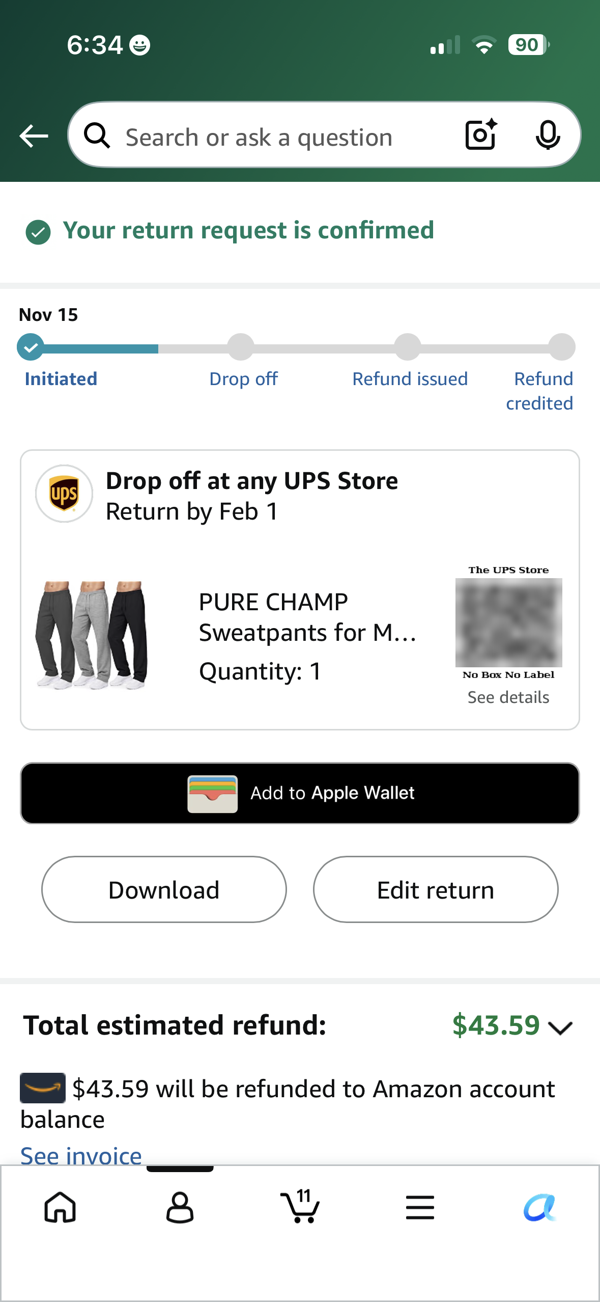
The QR code is on screen, in the Amazon app.
That Add to Apple Wallet button? About two-thirds of Happy Returns shoppers skip it.
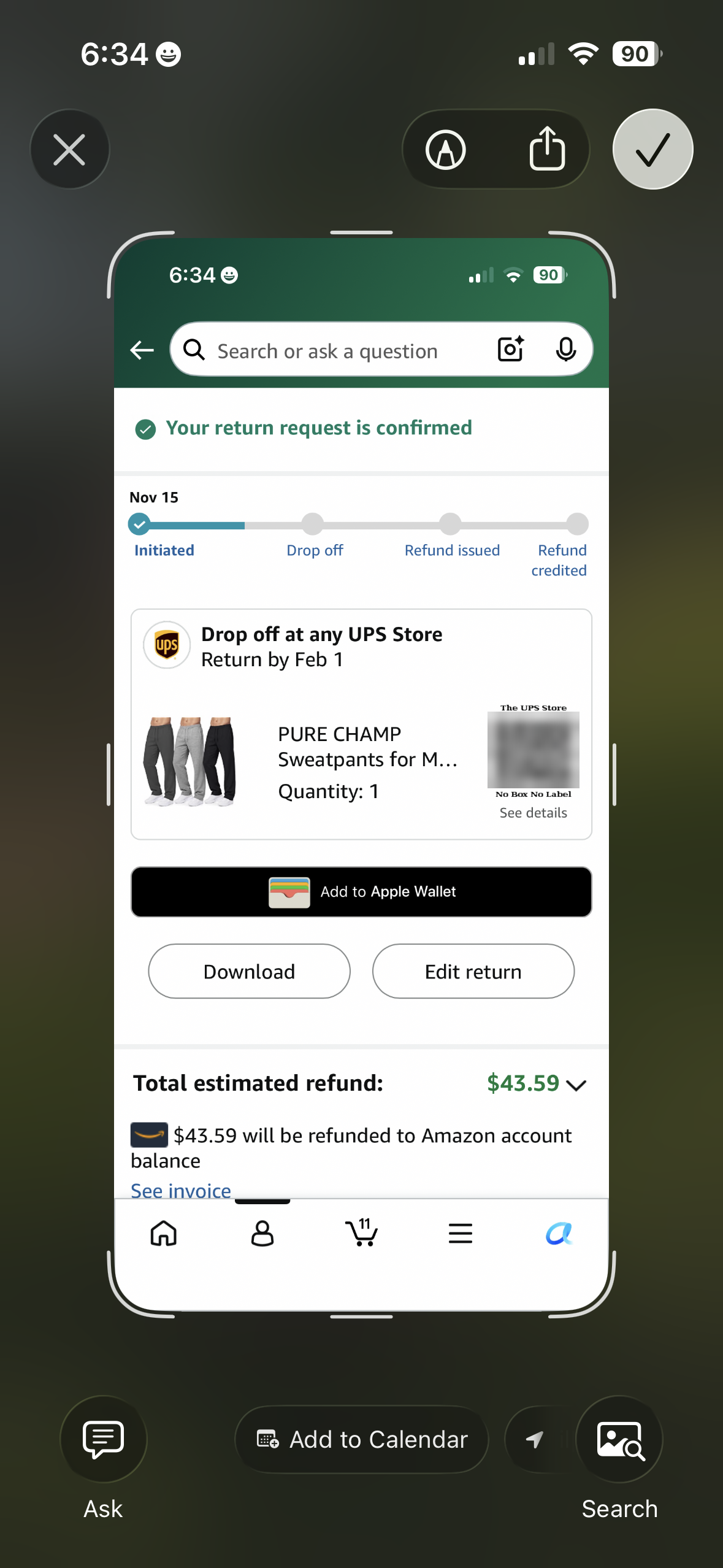
Tap Share, pick Island Returns, send.
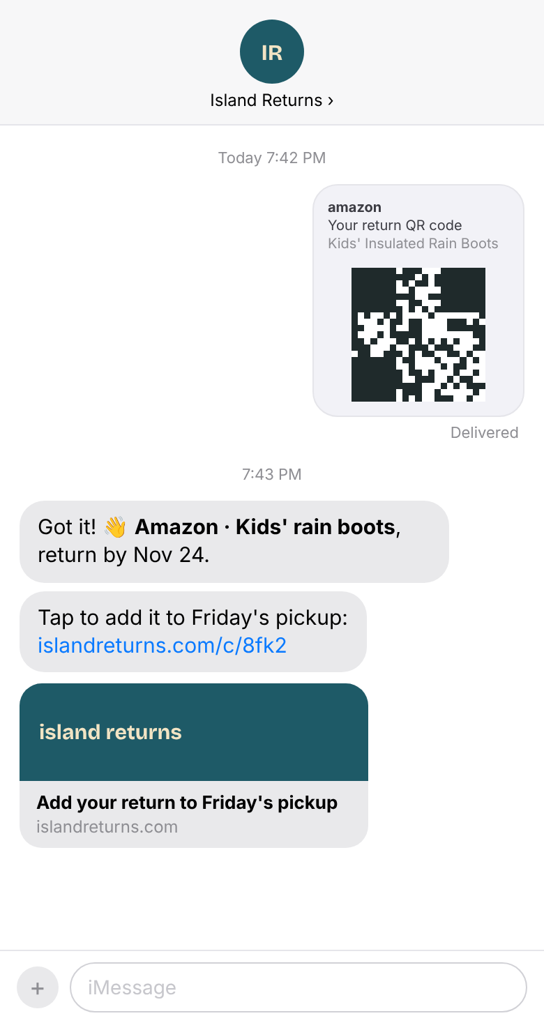
We read it and text back a link to confirm.
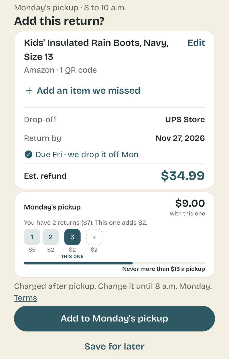
The link opens one screen with the details. One tap adds it to the pickup.
Other options I considered
Three rules held throughout: nothing joins a pickup without the customer's OK, no setup that feels technical, and no clutter added to the app.
Retailers email return details, so I considered showing customers how to auto-forward every one of those emails. It would be zero effort once set up, but setup needs a multi-step guide and a verification code. When I mocked it up, it was too confusing and I doubted users would take the time to do it.
Island Returns right in the share sheet. It's the best version, but it needs an iOS app that customers would have to download, and many people prefer web apps. I won't build it until I've run the service for a while and know there's real demand.
A ready-made prompt that customers could copy into their own AI agent, such as Muse, so it forwards return emails or texts screenshots for them. It could be a neat shortcut someday, but it's ahead of where most people are today. Most customers don't use an agent yet, so I'd rather meet them in Messages and email.
What it looks like now
Design mockups, rolling into the demo now.
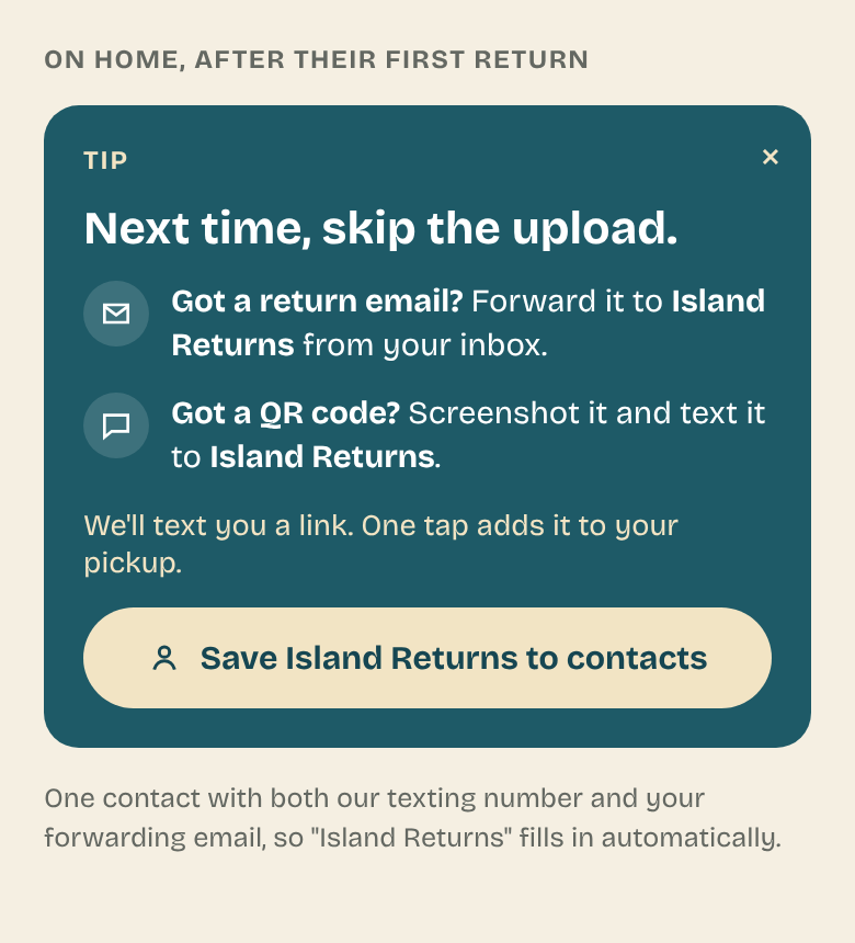
After the first return, a one-time tip offers to save Island Returns as a contact.
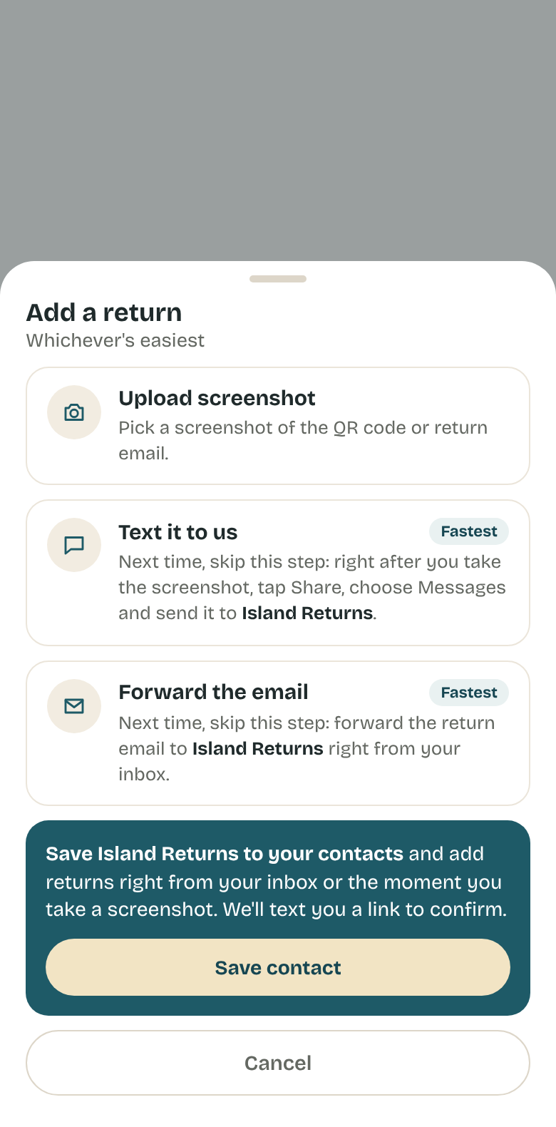
Every time they add a return in the app, the shortcuts say "Next time, skip this step."
Screenshot, share to Island Returns. AI reads it and texts back a link within a minute.
The link opens one screen. The customer, not the AI, decides what goes on the route.
First, a quick one: when you start an online return, what do you do with the QR code?
Keep that in mind for the question below.
How would you get people to take the fastest path without cluttering the app?
Are in-app hints the right approach? Pick the one you'd bet on and see how others voted too.